Cover Contest Stories
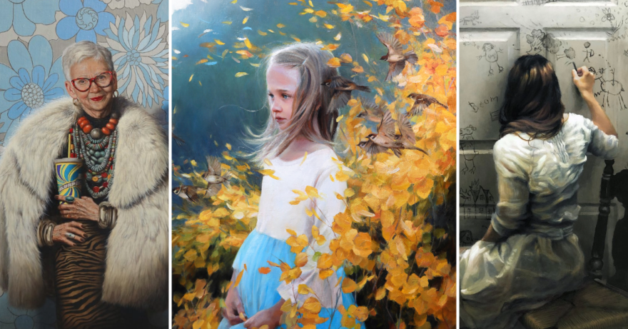
The five winning works in our second annual Artists Magazine Cover Competition are compelling compositions that may intrigue or charm, but definitely captivate.
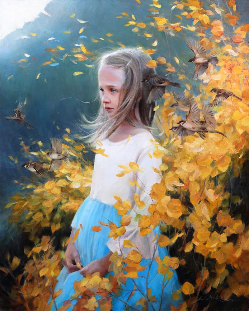
Determining the winner of the annual Artists Magazine Cover Competition is a delightfully daunting task, as the editorial team discovered after pouring over nearly 1,000 entries in the second annual art competition. It’s a veritable feast for the eyes as we consider visual impact, engaging composition, emotional appeal, and stellar technique and execution. This year, we’re beyond pleased to serve up all five winning paintings in full-sized cover format, with Rose Anna Bain’s enchanting work, Taking Flight, as the overall cover winner.
This article originally appeared in Artists Magazine. Subscribe now so you don’t miss any great art instruction, inspiration, and articles like this one.
We asked Bain—and the four other artists who round out our top five—to share the behind-the-scenes stories of their cover-worthy paintings. Enjoy the inside scoop!
Top Winner: Anna Rose Bain
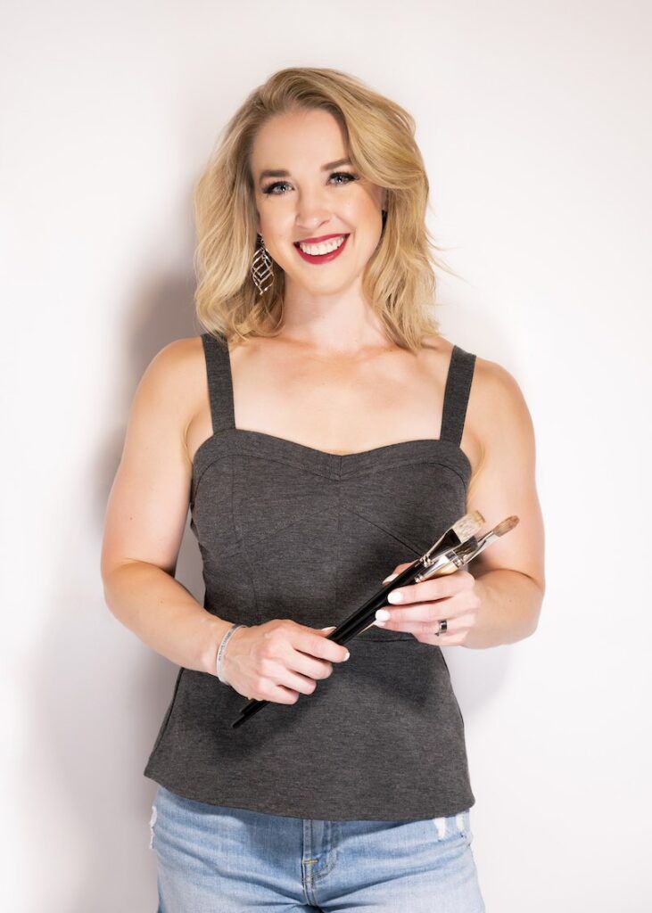
Anna Rose Bain graduated with honors from Hillsdale College, in 2007, and was the first student in the school’s history to have a solo senior show. During her undergraduate studies, she also took a figure painting course at the Florence Academy of Art, in Italy. She now works full-time as an oil painter and commissioned portrait artist. She also teaches workshops, creates instructional art videos and is actively involved in the local arts communities in Colorado. Bain is a Signature Member of the Oil Painters of America—for which she won the Gold Medal at the 2022 National Juried Exhibition. She’s also a member of the California Art Club and Plein Air Artists of Colorado, and is a Signature faculty member of the Portrait Society of America. Her award-winning work can be found in numerous private and public collections around the world. She lives in Arvada, Colo., with her husband and their two children.
What was your inspiration for your cover-winning Taking Flight?
I like to take my children outdoors for photo shoots in the spring and fall. I find that placing them in those settings—when the color is most vibrant and the weather is beautiful—is perfect for finding inspiration. I don’t always have an idea in mind, as was the case with this particular setting.
When I saw the reference photos of my daughter with the wind blowing her hair, and the aspen leaves swirling about her, I knew it had potential. The sparrows were an addition inspired by an earlier piece I’d done of her when she was an infant. In that painting, she was just learning to crawl, and I posed her with a fledgling sparrow. Here, she’s shown with grown sparrows flying all around her, symbolizing both her independent spirit and the passage of time.
Describe your typical painting process. Was there anything unique to your approach for this piece?
When I’m preparing to paint a studio piece like this one, I spend a great deal of time carefully looking through my reference photos (of which I take hundreds!) and stitching together bits and pieces of them in Photoshop until I have what I call a “mock-up.” I’m always looking at my photos and mock-ups as small thumbnails on my computer and trying to decide if my design reads well.
I’m also choosing a color harmony for the piece and trying to determine the dominant focal point. Only after I’ve made these decisions do I begin the painting; however, as was the case with Taking Flight, there are often many different directions I might still take with a piece. In this painting, I wasn’t satisfied with the gestures of the aspen branches and foliage in my reference photos, so I changed them up to create the shape and movement I wanted. Ultimately, I wanted the leaves to suggest angel wings behind the figure, without being too obvious or kitschy.
What is that draws you to the human face and figure as a subject?
I’ve always been interested in faces and figures because each human being is completely unique. And I can say this even though I have an identical twin sister. I love the challenge of capturing a likeness, not just technically, but emotionally. Finding that special something that makes up that person’s aura or essence—the flame beneath the surface—is my favorite kind
of challenge.
What was it about the piece that struck you as demonstrating magazine “cover potential”?
From a practical standpoint, I knew that the size and orientation would work. From an artistic stance, I felt that it was a perfect combination of eye-catching colors, intriguing subject matter and imagination.
Tell us something about your future plans or goals.
Currently, I’m in the throes of balancing my art with raising two young children, but as they get older, I plan to pursue more things. I hope to one day teach more international workshops. I’d also love to have a solo show; perhaps in the next few years I’ll be ready to take that on. Most of all, I plan to keep painting no matter what life throws my way. I have faith that all good things will come in time.
Learn more at artworkbyannarose.com.
Second Place: Mary Carroll
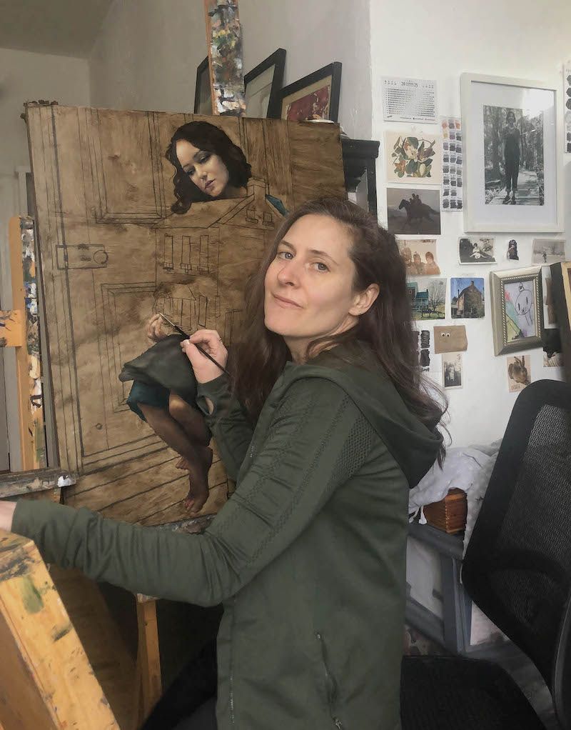
Mary Carroll received her MFA in painting and art history from Radford University and was awarded “best graduate thesis.” Her work has earned multiple awards and recognition from the Portrait Society of America and the International Art Renewal Center Salon, and earned The BoldBrush Award, in 2023. Her paintings have been exhibited at Wausau Museum of Contemporary Art, in Wausau, Wis., and the Taubman Museum of Art, in Roanoke, Va., and at national art galleries.
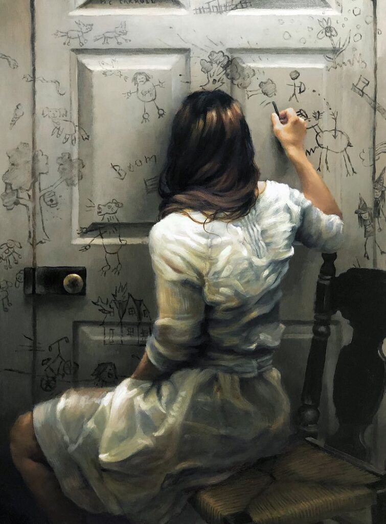
What was your inspiration for Self-Portrait With Memory?
At the time of its conception, I was preparing a new body of work for a solo show at Abend Gallery, in 2022. I had come across some overflowing albums of my childhood drawings that my mother had gathered, and
I wanted to revisit some of those ideas for a painting. I completed almost a dozen new paintings for the exhibition, and inside the many months spent with my past, I began to visualize a painting that would carry various recollections at once.
I grew up in rural West Virginia in a home without television and other modern distractions; I was encouraged to entertain myself with objects in nature. Left with the workings of my imagination and observations of the world around me, I translated my understanding into paintings. For this painting, I wanted it to be as if I were drawing the images on the door with my child’s mind and hand instead of the adult body that I inhabit in the painting.
Describe your typical painting process. Was there anything unique to your approach for this piece?
Ordinarily, I physically stage my imagined ideas using lighting, model and props as references for the painting. And often, I work from my imagination, too, but with this one I actually drew the memories on the doorway in my studio. I wanted a better look at how the charcoal skips across the door’s surface. It was challenging to actualize what the memories may have looked like had I drawn them as a child, so I referred again to the old albums so that I might see how I formed a tree or a bear and so on. I practiced each memory multiple times in a sketchbook before choosing those that I liked best.
What was it about the piece that struck you as demonstrating “cover potential”?
I believed that its graphic properties were ideal for cover material.
Learn more at merrysee.com.
Third Place: Robert Papp
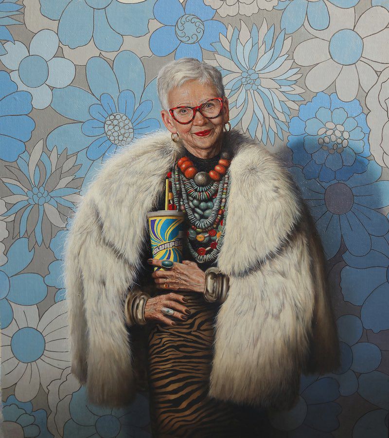
Robert Papp attended DuCret School of the Arts, in Plainfield, N.J. After many years of commercial illustration, he now spends his time at the easel. His oil paintings have been featured on the covers of best-selling novels, children’s books, and in advertising campaigns and a stamp series for the U.S. Postal Service. His work can be found each month on the cover of Cooks Illustrated.
What was your inspiration for Retired?
For me, this was an extremely fun piece to work on. My cover model is Carol, a friend, former neighbor, and retired schoolteacher, who has posed for me in the past. She’s nothing but class and sophistication, and I decided to have some fun and show a different side of her. I like to think that everyone has some degree of “wild child” in them and, even if it doesn’t come out in life, it can be captured on canvas. My usual body of work tends to be of more tranquil subject matter, whether it be still life or figurative, so this piece was an enjoyable chance to venture out of that zone.
Describe your typical painting process. Was there anything unique to your approach for this piece?
I’ve been motivated to paint by the simplest of things, but my creative process usually begins with something spontaneous. It could simply be seeing how light is falling on something or someone or being inspired by a unique object or person. No matter what the influence, I usually take photos references. My years as an illustrator taught me that. Plus, I’d never ask my model to pose for the long amount of time it takes for me to complete a painting.
I do some value sketches and, if I have color questions, a small color study or two. I paint on linen mounted to board, and once my drawing is transferred to the canvas, I work from dark to light, creating an underpainting with burnt umber. This establishes the correct value range of the painting.
What was it about the piece that struck you as demonstrating magazine “cover potential”?
My original concept for this piece was a very graphic portrait. Even though it’s extremely detailed, it’s still basically large shapes, which I thought would look bold on a cover. My goal was that the piece would be initially eye-catching and then draw the viewer in to stay a while for a closer look at the details.
Learn more at robertpapp.com.
Fourth Place: Irina Ganina
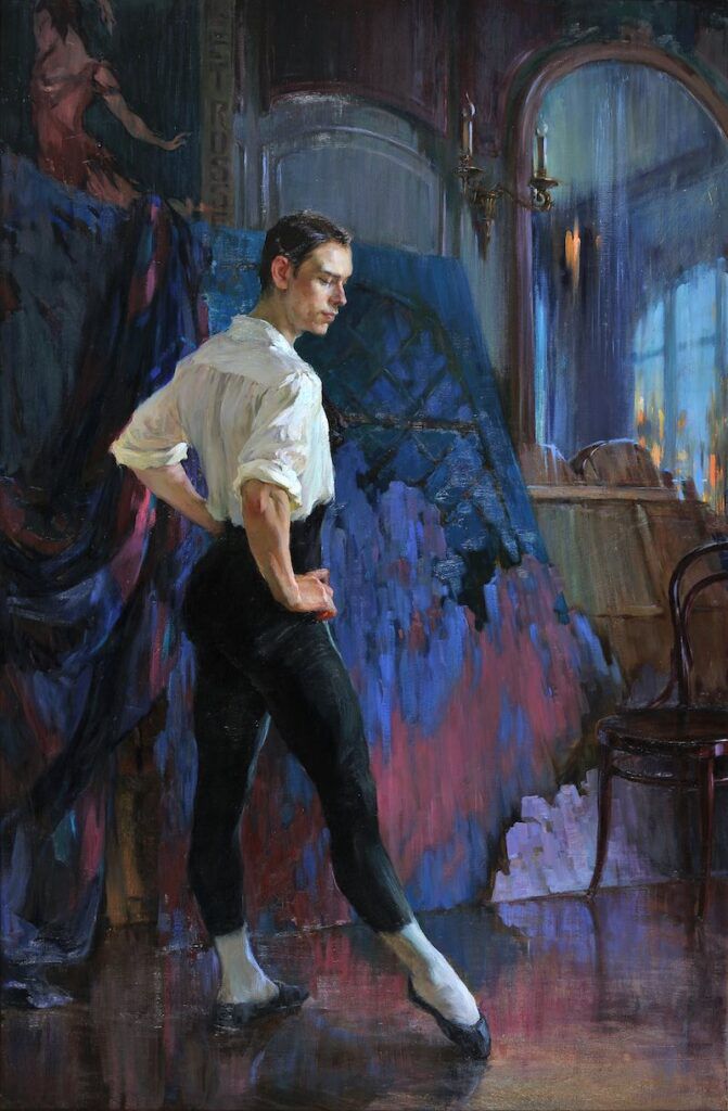
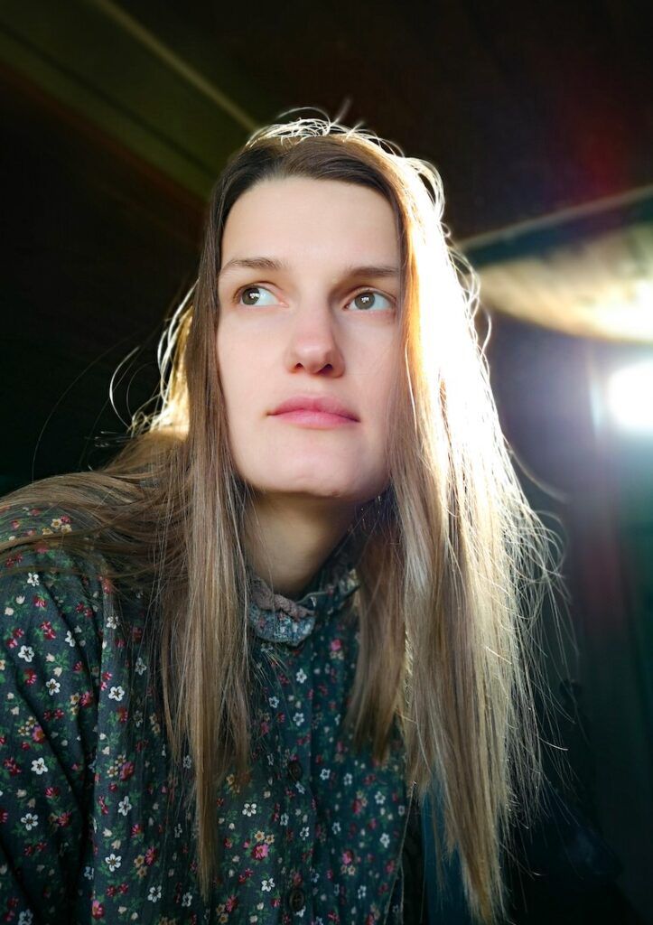
Irina Ganina studied at the Moscow College of Decorative and Applied Arts before studying classical painting at the Academy of Painting, Sculpture and Architecture with Ilya Glazunov. She has painted portraits of actors from theater and cinema in a collaboration with the Zolotoy Ples Gallery. She has also taught painting, drawing and composition at the Florence Classical Arts Academy, in Italy. The freelance artist divides her time between Russia and Switzerland.
What was your inspiration for The Dancer?
The Dancer depicts the famous Russian ballet dancer and choreographer Vaslav Nijinsky (1899–1950), one of the first male ballet dancers. The historic portrait of the revolutionary artist depicts his complex and somewhat contradictory character of an introverted person who expressed himself as an artist on stage before a schizophrenia diagnosis.
Describe your typical painting process. Was there anything unique to your approach for this piece?
Because I usually paint from real life—be it person or landscape—I had to go on a different journey for this historical life-sized reconstruction. Even though the method of oil painting with loose, dynamic brushstrokes remains the same, the process required more preparation.
The biggest challenge in painting a historical portrait is creating a face with a natural expression without being able to study that face in real life. Because I wanted to paint Nijinsky in the deeply concentrated process of preparing for a role, instead of showing him on stage, the facial expression had to be delicate. I used a few models for the pose, as well as those who had a similar likeness to Nijinsky, in combination with historic photographs, to create natural lights and colors to depict a person I’ve never met.
What was it about the piece that struck you as demonstrating “cover potential”?
The bright, warm colors of the figure pop out from the dark, cold background and create a clear focal point, which makes the big painting work even in a small format. The calm, thoughtful pose of the figure invites the viewer to observe the scene in anticipation of what might happen next.
See more on instagram @irinaganina.art.
Fifth Place: Jey Moore
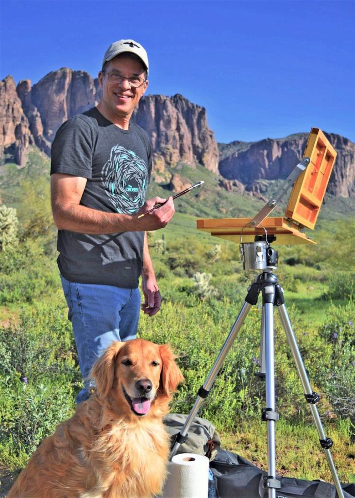
Jey Moore graduated from Arizona State University and honed his painting skills at the Scottsdale Artists School with instructors such as Mark Daily, Matt Smith and Scott Christensen. Moore was invited to be an instructor at the school, where he taught from 1995–2001. His work has been recognized in numerous national art competitions and was selected for the U.S. Department of State Arts in Embassies Program, in Geneva, Switzerland.
What was your inspiration for Monterey Bay?
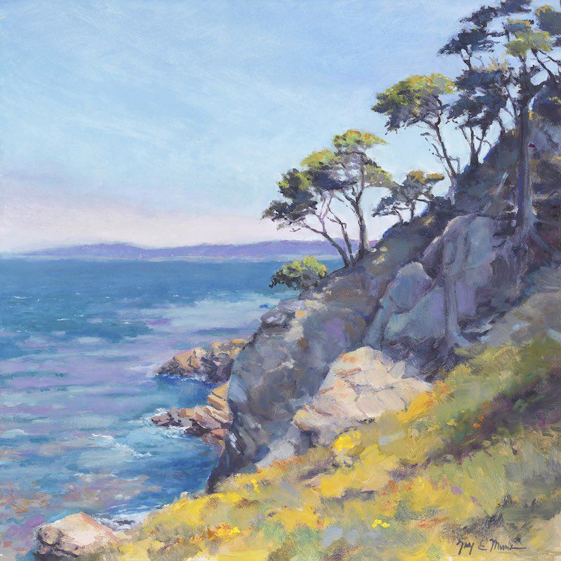
The Monterey Bay National Marine Sanctuary, in California, surrounds the Point Lobos Nature Reserve. This view looks north from the reserve toward Carmel Bay. I love the unique shapes of the Monterey Cypress climbing the granite shoreline. Depending on the sunlight, the ocean’s color can range from cold steel to warm turquoise. It’s such a unique place.
Most of my work is landscape—land, sea and sky. I love to hike and spend time in nature. Stopping and observing creation’s beauty is a gift in a fast-paced world. Painting allows me to study the nuances of a place and discover hidden treasures I might pass by. There’s joy in creating as well as viewing the finished product.
Describe your typical painting process. Was there anything unique to your approach for this piece?
Once I find inspiration, I hold on to that vision throughout the painting process. I spend a fair amount of time composing a scene. It’s important not to lose the feel of a place when you constrain it to a canvas. Getting the fundamentals right at the beginning is most of the effort. I repeatedly compare, contrast and adjust the painting elements through each process step, from blocking-in to details and highlights. The closer I get to finishing a painting, the more time I spend critiquing and the less time I spend putting paint on the canvas.
What was it about the piece that struck you as demonstrating magazine “cover potential”?
A good painting, like a good book, draws you in. I always ask myself, “If I were to step into this painted scene, what would my senses tell me?” I try to capture the feel a place gives me instead of just copying a scene. I look for visual cues that support the experience. When I look at this painting, it takes me back to the first time I hiked the Point Lobos Nature Reserve.
Learn more at jeymoore.com.





Join the Conversation!